Creating Custom 404 Page
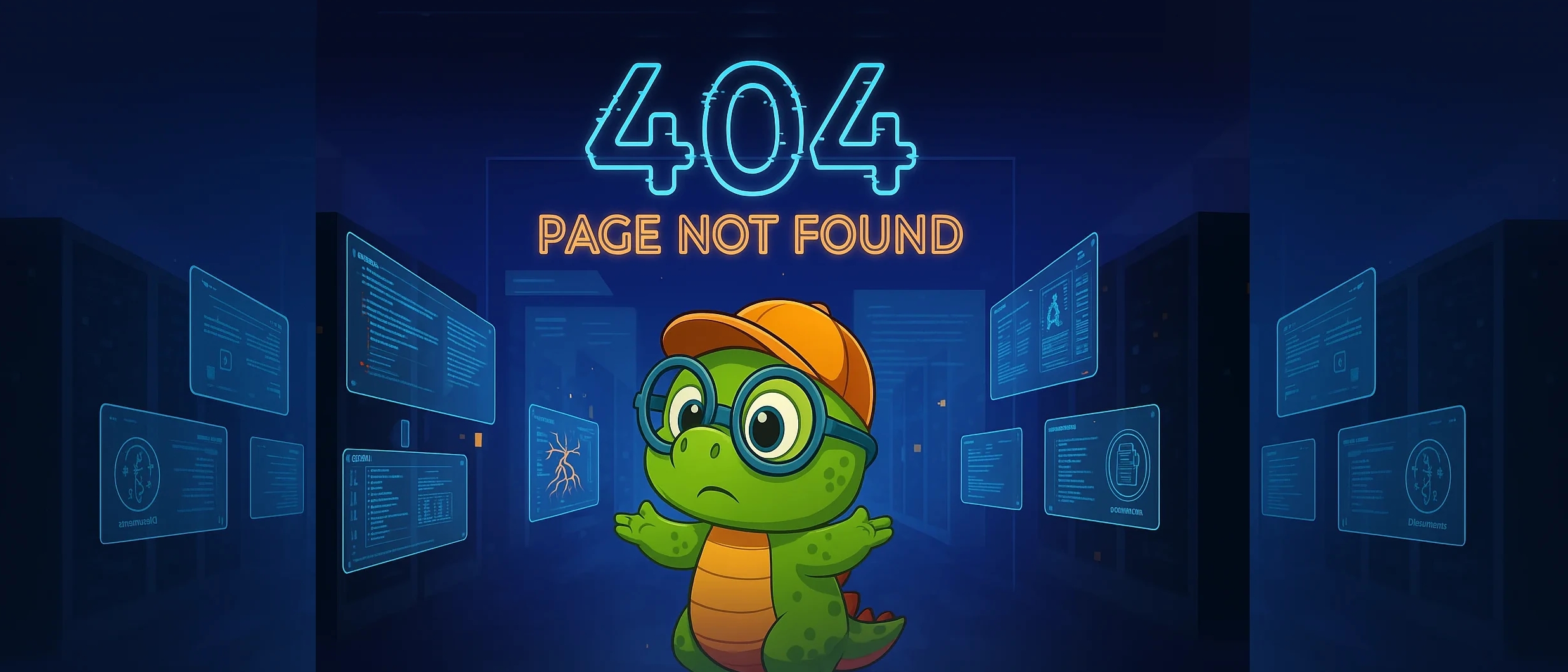
The default 404 page in Docusaurus is functional, but quite basic. For many years now, it has become a page that allows you to stand out even though it's the result of a website flaw (broken link or unredirected URL). Building a stylish 404 page is therefore an opportunity to provide a better experience when a link breaks. Here's how I set up a custom 404 with Docusaurus, keeping the page lightweight and responsive.
Objectives for the custom 404 page
- Full screen with a dedicated background image
- Simple, readable, centered text
- Optimized mobile version (image and adapted viewport units)
- Minimal implementation via Docusaurus swizzle mechanism
I could have added home or search buttons, but I wanted to keep the page very lightweight.
Swizzle the NotFound/Content component
Docusaurus exposes a 404 view via @theme/NotFound. I swizzled its Content part to customize the rendering.
Command
npm run swizzle @docusaurus/theme-classic NotFound --eject
-
@docusaurus/theme-classic→ the theme you want to modify (default for most sites). -
NotFound→ the 404 page component. -
--eject→ creates a real local copy of the component you can edit.
This creates the override in src/theme/NotFound/Content/.
Files structure
The React component
We just created what will allow us to customize the 404 page rendering.
Basic file
import React from 'react';
import Content from '@theme-original/NotFound/Content';

export default function ContentWrapper(props) {
  return (
    <>
      <Content {...props} />
    </>
  );
}
Custom file
import React from 'react';
import Content from '@theme-original/NotFound/Content';
import styles from './styles.module.css';

export default function ContentWrapper(props) {
  return (
    <div className={styles.notFoundBg}>
      <h1 className={styles.hideh1}>404 -Page Not Found</h1>
      <p>We could not find what you were looking for.

Please contact the owner of the site that linked <br />
you to the original URL and let them know their link is broken.</p>
    </div>
  );
}
Note: I keep an <h1> for semantics and accessibility, but I hide it visually with CSS since the image meets my needs.
Full screen, responsive and lightweight styling
.notFoundBg {
	min-height: calc(100dvh - var(--ifm-navbar-height, 0px));
	background: url('/img/404bg.webp') no-repeat center center fixed;
	/* Fill the screen: crop if necessary */
	background-size: cover;
	position: relative;
	display: flex;
	flex-direction: column;
	align-items: center;
	justify-content: center;
	padding: 2rem 1rem;
	overflow: hidden;
}

/* Mobile adaptation: avoid "fixed" and show more of the image */
@media (max-width: 768px) {
  .notFoundBg {
    background-attachment: scroll;
    background-position: center top;
    background-size: contain;
    /* use modern svh unit to handle mobile URL bar */
    min-height: calc(100svh - var(--ifm-navbar-height, 0px));
  }
}
.hideh1 {
    display:none;
}


/* Mobile: dedicated image + adapted typography */
@media (max-width: 768px) {
  .notFoundBg {
    background-image: url('/img/404mobile.webp');
    background-attachment: scroll;
    background-position: center top;
    background-size: cover;
    min-height: calc(100svh - var(--ifm-navbar-height, 0px));
  }

  .notFoundBg p {
    font-size: clamp(1rem, 4.5vw, 1.25rem);
    line-height: 1.6;
    padding: 0 1rem;
  }
}
Key points:
- Optimized WebP images:
static/img/404bg.webp(desktop) andstatic/img/404mobile.webp(mobile) to learn more about image optimization See Cavo789's tutorial - Modern viewport units:
dvh/svhhandle URL bars/mobile bounds better thanvh background-attachment: scrollon mobile to avoid stuttering and improve iOS compatibility (yes I love apples)- Adaptive typography via
clamp()to stay readable on small screens
Add the assets
Place your images in static/img/ so they're served from the site root. Naming is up to you, but here are mine:
/img/404bg.webp/img/404mobile.webp
You can generate two versions (desktop/mobile) to reduce the weight transferred on mobile and have a cleaner rendering.
Quick testing
For quick testing use this command
npm start
In development, launch the site and visit a non-existent URL (for example /url-that-does-not-exist). You should see the full-screen background and the centered message.
This is just the beginning
Some ideas to go further:
- Add a "Back to home" or "Search" button
- Instrument an analytics event to know how often the 404 is viewed
- Adapt the illustration in dark mode (if you force a light/dark image)
- Add light CSS animations to make the page more dynamic
- Add a more personalized error message (for example, based on the URL)
- Indicate useful links (FAQ, support, etc.)
- Record the initial request
In the end, swizzling only NotFound/Content is enough to create a custom, expressive and performant 404, while staying aligned with Docusaurus theme architecture.
Now it's your turn! For inspiration, you can check out creative 404 page sites like https://www.404s.design/ or https://www.awwwards.com/40-inspiring-404-error-pages.html
This article is part of the Design your site series:
Loading comments…
Related posts
Component LogoIcon
September 15, 2025

Component Card
September 7, 2025

Component ImageOnClick
September 5, 2025


