Front Matter CMS: templates, snippets and custom actions





For three articles, we took Front Matter as it comes out of the box: installed, finely configured, used day to day. Nothing we added to the tool itself.
This article changes register. We are going to extend Front Matter: teach it to pre-fill articles, to insert ready-made blocks, to expose our own buttons in the panel, and to store its configuration across several files rather than one 450-line frontmatter.json. This is the moment the extension stops being a form and becomes part of the repository's tooling.
Create a pre-filled article from a template, define snippets for your recurring MDX components, add a home-made button that runs a Node script, and split frontmatter.json into thematic files under .frontmatter/config/.
Templates: never start from a blank page
In article 2, Create content generated an empty article — just the front matter derived from the content type, and a hopelessly blank body. So for every new article I pasted back the same pieces: the badge block, the <div className="text--justify">, the {/* truncate */}. Copied from the previous article, every single time.
A template removes that gesture. It's a complete Markdown file — front matter and body — that Front Matter copies at creation time.
First practical point: at initialization, Front Matter does not create the .frontmatter/templates/ folder. If you'd rather start from scratch, run Front Matter: Initialize the template folder first, or create the folder by hand.
The simplest route, though, is to start from an existing article you like, then click Create template, in the panel's Other actions section, with the article open — the action creates the folder along the way and drops the file in it.
 The button may appear greyed out depending on which file is in the foreground: open the article you want to turn into a template before clicking. The same action exists in the command palette, if you prefer the keyboard:
Front Matter: Create a template from the current file
The file lands in .frontmatter/templates/, alongside the configuration:
You can then trim it down to the reusable skeleton:
---
title: ""
slug: ""
description: ""
authors:
- docux
mainTag: ""
date: ""
draft: false
inLanguage: en
series: ""
---
<div>
<center>
[](https://github.com/Juniors017)
</center>
</div>
<div className="text--justify">
{/* truncate */}
</div>
A single setting switches the mechanism on — the feature is off by default:
"frontMatter.templates.enabled": true
No need to name the folder: frontMatter.templates.folder already defaults to .frontmatter/templates; you only declare it to keep your templates somewhere else.
From then on, Create content offers to pick a template instead of starting from nothing. The link can even be made permanent: the template property set on a content type forces every new article of that type to start from the designated template.
{
  "name": "article",
  "template": ".frontmatter/templates/article.md",
  "fields": [ "..." ]
}
A new article from a template
When creating a new article, pick the template you want to start from.


The content type describes the form (which fields, which types). The template provides the starting content (default values and the body of the file). One fills the panel, the other fills the page. They complement each other; they don't compete.
Snippets: your MDX components one click away
A Docusaurus blog is MDX stuffed with home-made components. On this blog I keep reusing <Columns>, <Terminal>, <Trees>… and I can't be bothered to type it all out — sometimes I don't even remember the exact structure of the nested tags, even though most of these are components I wrote myself. The result: I reopen an old article to copy the pattern. More copy-paste.
Snippets (the scissors icon in the interface) answer exactly that. They are defined in frontMatter.content.snippets, and — pleasant surprise — we've had one since article 2, quietly slipped in to make my writing easier.
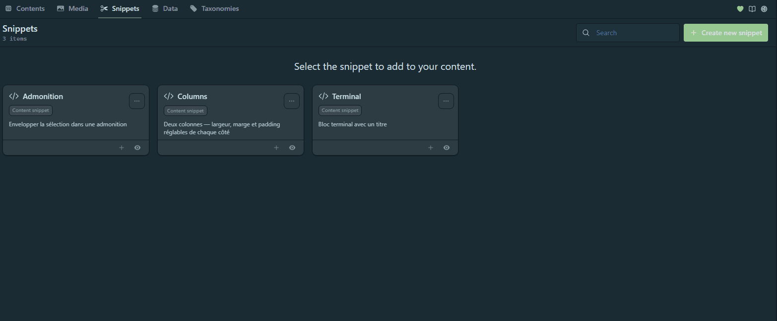
Each string in body is one line; the Insert snippet button (or the dashboard's Snippets view) drops the block at the cursor. As it stands, that's fixed text — handy, but a snippet shows its true worth as soon as you add fields.
"frontMatter.content.snippets": {
  "Columns": {
    "description": "",
    "body": [
      "<Columns>",
      "<Column>",
      "",
      "</Column>",
      "<Column>",
      "</Column>",
      "</Columns>"
    ],
    "fields": []
  }
}
So let's take that same <Columns> and push it all the way: width, margin, padding and content, adjustable on each side. Eight fields, and not a single class left to remember.
"Columns": {
  "description": "Two columns — width, margin and padding adjustable on each side",
  "body": [
    "<Columns>",
    "<Column className=\"[[leftWidth]] [[leftMargin]] [[leftPadding]]\">",
    "[[&leftContent]]",
    "</Column>",
    "<Column className=\"[[rightWidth]] [[rightMargin]] [[rightPadding]]\">",
    "[[&rightContent]]",
    "</Column>",
    "</Columns>"
  ],
  "fields": [
    { "name": "leftWidth", "title": "Left — width", "type": "choice", "choices": ["col--6", "col--8", "col--4", "col--3", "col--9"], "default": "col--6" },
    { "name": "leftMargin", "title": "Left — margin", "type": "choice", "choices": ["margin--none", "margin--sm", "margin--md", "margin--lg", "margin-vert--md"], "default": "margin--none" },
    { "name": "leftPadding", "title": "Left — padding", "type": "choice", "choices": ["padding--none", "padding--sm", "padding--md", "padding--lg"], "default": "padding--none" },
    { "name": "leftContent", "title": "Left — content", "type": "string", "default": "FM_SELECTED_TEXT" },
    { "name": "rightWidth", "title": "Right — width", "type": "choice", "choices": ["col--6", "col--4", "col--8", "col--9", "col--3"], "default": "col--6" },
    { "name": "rightMargin", "title": "Right — margin", "type": "choice", "choices": ["margin--none", "margin--sm", "margin--md", "margin--lg", "margin-vert--md"], "default": "margin--none" },
    { "name": "rightPadding", "title": "Right — padding", "type": "choice", "choices": ["padding--none", "padding--sm", "padding--md", "padding--lg"], "default": "padding--none" },
    { "name": "rightContent", "title": "Right — content", "type": "string" }
  ]
}
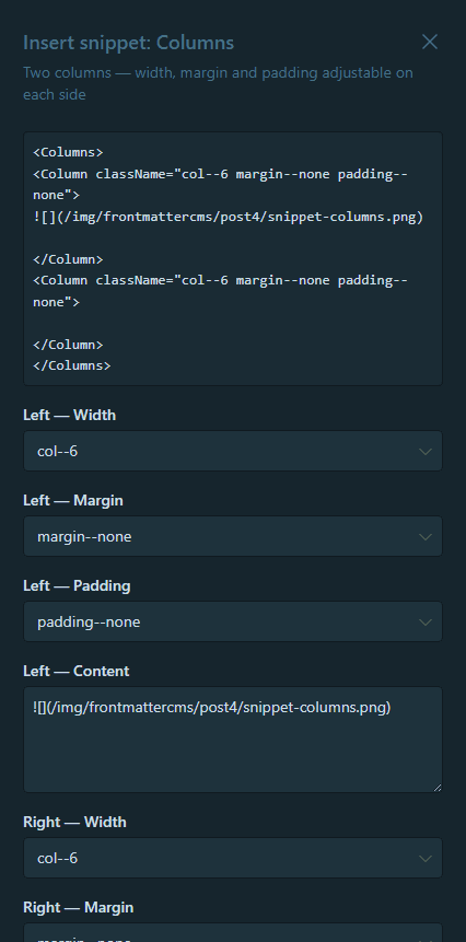
Three ideas can be read in that block:
- Placeholders receive the values you type, and nothing stops you concatenating several inside one attribute:
className="[[leftWidth]] [[leftMargin]] [[leftPadding]]"composes the final class from three dropdowns. The[[ ]]delimiters are configurable too (openingTags/closingTags). - A
choicefield enforces a closed list — here Infima's grid and spacing classes, which our<Column>component passes straight through. No more mistypedcol--7: you pick from a list. The--nonevariants serve as the "nothing" option, so you never leave an empty class. FM_SELECTED_TEXTis the magic value: a field with that default pre-fills itself with the selected text, and the body placeholder sharing itsnamereceives it. Select a paragraph, insert the snippet, choosecol--8thencol--4: your text fills a wide left column, a narrow one waits on the right.- The ampersand before the name —
[[&leftContent]]rather than[[leftContent]]— is not decorative, and it's the subject of the next callout.
Front Matter escapes into HTML entities everything a placeholder inserts. My first Columns used [[leftContent]]: I selected a paragraph from this very article, inserted the snippet, and got this back in my MDX —
A Docusaurus blog is MDX stuffed with home-made components. I can't be…
`<Columns>`, `<Terminal>`…
Every apostrophe, every backtick, every angle bracket transformed. The paragraph rendered exactly like that on the page, entities included.
The & prefix asks for the raw value: [[&leftContent]]. Apply it to every placeholder carrying free text, a path or markup — in practice, all your string fields. choice fields that only hold class names don't need it.
One limitation all the same: the selection is single, it feeds only one field. The right-hand content is therefore still to be written — and for code or an image, better to leave the field empty and type directly in the editor, where writing is more comfortable.
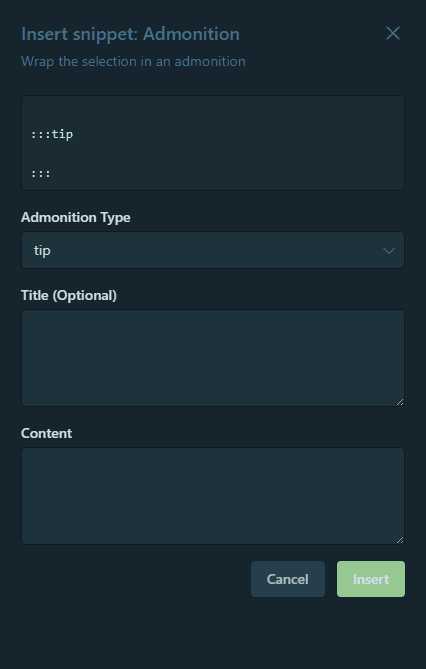
Let's put it all together. Here is the snippet I should have written at the very start of this series: it wraps the selected text in an admonition, whose type is picked from a list — including this blog's home-made :::docu. A choice field for the type, a free field for the title, and the selection pulled in automatically:
"Admonition": {
  "description": "Wrap the selection in an admonition",
  "body": ["\n:::[[type]] [[&title]]", "[[&selection]]", ":::\n"],
  "fields": [
    {
      "name": "type",
      "title": "Admonition type",
      "type": "choice",
      "choices": ["tip", "info", "caution", "danger", "note", "docu"],
      "default": "tip"
    },
    { "name": "title", "title": "Title (optional)", "type": "string" },
    { "name": "selection", "title": "Content", "type": "string", "default": "FM_SELECTED_TEXT" }
  ]
}
The gesture becomes: I select an already-written paragraph, fire the snippet, pick caution from the list, type a title — and my paragraph ends up boxed, without my typing ::: even once. Three kinds of value (closed list, free text, selection) in a single snippet: that's where you see the tool does more than insert dead text.
The MDX trap to know about: turn off the wrapper
If you take only one thing away from this section, make it this one — and settle it before inserting your first snippet. By default, Front Matter surrounds every inserted snippet with comments recording its id and its field values, so it can re-edit it later. Your fine admonition therefore arrives wrapped like this:
<!-- FM:Snippet:Start data:{"id":"Admonition","fields":[…]} -->

:::tip[Tip]
Your content.
:::

<!-- FM:Snippet:End -->
On a pure Markdown generator, those HTML comments are invisible in the output — the mechanism is even rather clever. But Docusaurus, in my setup, reads MDX, where <!-- --> is not a valid comment: the two FM:Snippet lines display as-is on the published page. I walked into it while testing the snippets for this article.
The fix is one line:
"frontMatter.snippets.wrapper.enabled": false
The only cost: Front Matter can no longer find an already-inserted snippet to modify it in place. On this blog, where a snippet is a springboard and then lives its life as MDX, that's a trade worth making.
Snippets for your media
While creating a snippet from the dashboard, one option intrigues: "Is a media snippet?", described as "Use the current snippet for inserting media files into your content". That's the isMediaSnippet field in the JSON. Ticked, it completely changes the snippet's entry point: instead of appearing in the editor to wrap text, the snippet attaches itself to the media library cards — you apply it to an image rather than to a selection.
Its placeholders are therefore no longer yours, but those supplied by the media: mediaUrl, alt, caption, filename, title, mediaWidth, mediaHeight. Enough to wire our home-made lightbox, <ImageOnClick>, straight onto an image from the library — without ever copying a path by hand:
"Lightbox": {
  "description": "From a media card: insert the image into the ImageOnClick lightbox",
  "isMediaSnippet": true,
  "body": [
    "<ImageOnClick imageUrl=\"[[&mediaUrl]]\" altText=\"[[&alt]]\" buttonName=\"[[&buttonName]]\" className=\"[[imageClass]]\" />"
  ],
  "fields": [
    { "name": "buttonName", "title": "Link label", "type": "string", "default": "View the image" },
    { "name": "imageClass", "title": "Image class", "type": "choice", "choices": ["", "margin-vert--md", "margin-vert--lg", "shadow--lw", "shadow--md", "shadow--tl"], "default": "" }
  ]
}
Here too, the ampersand is essential: without it, [[mediaUrl]] produces an unusable path, every / turned into /.
<ImageOnClick imageUrl="/img/post3/menucard.png" />
Another detail worth knowing: media fields only fill what exists. alt and caption draw from the image's metadata (mediaDb.json) — mine being empty, they arrive empty. Hence buttonName declared here as a field to fill in, with a default. Only mediaUrl is always automatic: it's the one you never want to type anyway.
The real click comes when you realise a media snippet isn't limited to a single tag: its body can be a whole layout. The pattern I use constantly throughout this series — a screenshot on one side, text or code on the other — then becomes a single click from the image's card:
"Image + columns": {
  "description": "From a media card: insert the image into a column, text on the right",
  "isMediaSnippet": true,
  "body": [
    "<Columns>",
    "<Column className=\"[[imageWidth]]\">",
    "<img src=\"[[&mediaUrl]]\" alt=\"[[&altText]]\" />",
    "</Column>",
    "<Column>",
    "",
    "</Column>",
    "</Columns>"
  ],
  "fields": [
    { "name": "imageWidth", "title": "Image column width", "type": "choice", "choices": ["col--6", "col--4", "col--8"], "default": "col--6" },
    { "name": "altText", "title": "Alternative text", "type": "string" }
  ]
}
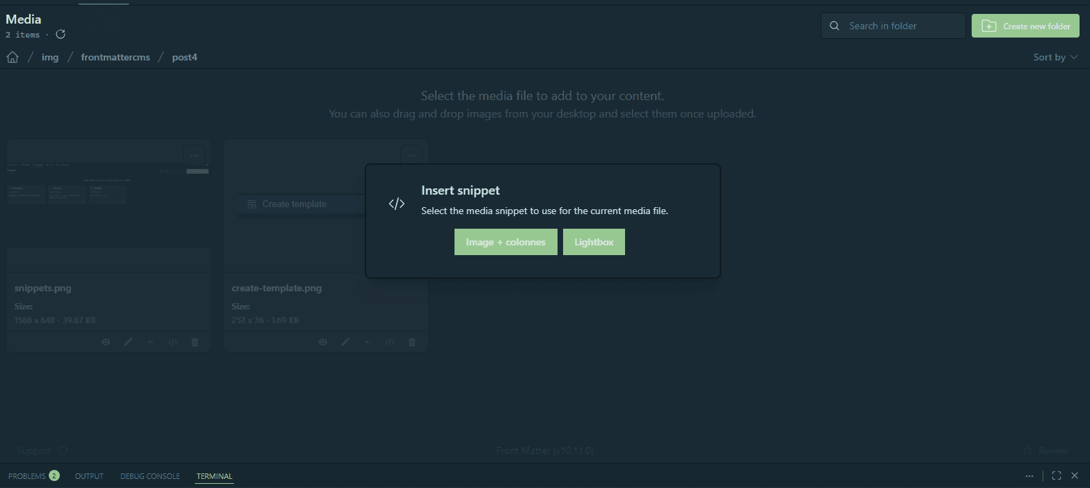
First reflex after declaring it: open an article, look for Insert snippet… and find nothing. That's normal, and the documentation is explicit: "You cannot insert media snippets into your content like you can with content snippets. Instead, you will find them on the media cards." A media snippet lives on the media library cards, never in the editor's list.
The gesture, in order:
- Open the article and place the cursor where the image should land.
- Go to the dashboard → Media tab.
- On the card of the image you want, trigger the snippet.
- Fill in your fields — here the column width.
The two-column structure is then inserted at the cursor of the article you left open, image in place, path never typed. All that's left is writing on the right.
Note that mediaUrl and alt are not declared in fields: they come from the media itself. alt draws from the image's metadata (mediaDb.json) — if, like me, you don't fill those in, it will arrive empty and still need completing by hand. A good reason to start.
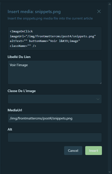
The full list of placeholders lives in the snippets documentation — it changes with the versions.
These two capabilities are separate, and that's exactly what the two features from the modes section are for: dashboard.snippets.view uses snippets (inserting them), dashboard.snippets.manage allows creating and editing them. A mode that keeps view without manage — like our minimal mode further down — lets the whole team insert the approved snippets, but prevents creating new ones on the fly. The library stays curated, versioned in the configuration.
Custom actions: your own buttons in the panel
This is the most powerful extension point, and the least known. Front Matter lets you add your own buttons to the panel, each running a Node script, through the @frontmatter/extensibility package:
npm i -D @frontmatter/extensibility
A script receives its context from ContentScript.getArguments() — filePath (the open file), workspacePath (the project root), the already-parsed frontMatter, and the answers to any questions asked of the user. It hands back control with ContentScript.done(), whose message shows up in the panel. Declaring the button takes four keys:
"frontMatter.custom.scripts": [
  {
    "title": "Clear the Docusaurus cache",
    "script": "./scripts/clear-cache.mjs",
    "command": "node",
    "output": "notification"
  }
]
The useful properties: output is either editor or notification, depending on whether you want to inject text back or merely show a message; type (content, mediaFolder, mediaFile) decides where the button appears; bulk allows running it over several files at once.
Before going further, a guardrail: don't reinvent what Front Matter already does. For example: the SEO panel counts the article's words — frontMatter.taxonomy.seoContentLengh even lets you set the target length — as well as the characters in the title and description. The extension also validates the front matter against the content type, and its Content Health panel measures readability, spots broken links and flags articles that are ageing. It even knows how to clear its own cache.
A home-made action is therefore only worth it for what the extension cannot know: your tooling, your services, your conventions.
Quick examples to set up. A few lines are enough to bring into the panel the commands you type at the terminal all day long:
- Clear the Docusaurus cache — the well-known
npm run clear, a mandatory reflex after adding an article or touching a plugin. The script runs it in the project folder and returns a notification. - Clear the npm cache —
npm cache clean --force, for the day a dependency refuses to install cleanly. - Copy the production URL — rebuild
https://your-site/blog/<slug>/from the front matter, to paste elsewhere without retyping it. - Check the alternative texts — a regex over the body counting images with no
alt. Content Health doesn't cover that, and it's a convention I care about.
More ambitious, for a quiet weekend. Here we plug in external services — and leave the extension's scope for good:
- Draft the BlueSky post. For every publication, I write by hand a 300-character hook pointing at the article. A script starts from the
titleand thedescription, assembles the text and checks the limit. - Publish to BlueSky, then write back the
blueSkyRecordKey. The logical extension: post through the API, retrieve the post's identifier and write it into the front matter (output: "editor"). That's precisely the manual gesture that closes every article in this series. - Build the social card. Generate the Open Graph image — title composited onto a template — with the same
sharpas this blog's image plugin, save it intostatic/, and set theimagefield.
None of these ideas exist in the extension, and the last ones cannot: they speak to your social host, your image pipeline, your bilingual setup. The extension supplies the button; you supply the domain knowledge.
A "Maintenance" area in the panel
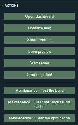
The first two ideas from the accessible list are now in my configuration, along with a build test, grouped under a common prefix:
"frontMatter.custom.scripts": [
  { "id": "maintenance-build", "title": "Maintenance · Test the build", "script": "./scripts/test-build.mjs", "command": "node", "output": "notification" },
  { "id": "maintenance-cache-docusaurus", "title": "Maintenance · Clear the Docusaurus cache", "script": "./scripts/clear-cache.mjs", "command": "node", "output": "notification" },
  { "id": "maintenance-cache-npm", "title": "Maintenance · Clear the npm cache", "script": "./scripts/clear-npm-cache.mjs", "command": "node", "output": "notification" }
]
An action's schema exposes id, title, script, command, output, outputType, type, bulk, hidden, nodeBin, environments and contentTypes — but no notion of a group. The Maintenance · prefix in the title is therefore a plain naming convention: the buttons line up visually one under the other, without the extension knowing anything about it. Effective, and free.
Clearing the Docusaurus cache takes three useful lines — the gesture you repeat after every new article:
// Front Matter custom action: clears the Docusaurus build cache
// (.docusaurus, build, node_modules/.cache) without leaving the editor.
// Declared in the config under frontMatter.custom.scripts.
import { execFileSync } from "node:child_process";
import path from "node:path";
import { ContentScript } from "@frontmatter/extensibility";

const { workspacePath } = ContentScript.getArguments();

// Call the Docusaurus binary with the current node: no shell, so no reliance
// on PATH or cmd.exe — essential when the extension launches the script
// outside a terminal.
const docusaurus = path.join(
  workspacePath,
  "node_modules",
  "@docusaurus",
  "core",
  "bin",
  "docusaurus.mjs"
);

try {
  execFileSync(process.execPath, [docusaurus, "clear"], {
    cwd: workspacePath,
    stdio: "pipe",
  });
  ContentScript.done("Docusaurus cache cleared — restart the dev server.");
} catch (err) {
  ContentScript.done(`Failed: ${err.message.split("\n")[0]}`);
}
The workspacePath handed over by getArguments() serves as the working directory: the script runs at the project root, whatever file is open. The try/catch returns the error as a notification rather than failing silently. Its npm twin is identical, give or take the command.
npm from the scriptMy first version did execSync("npm run clear"). In a terminal, flawless; from the button, a flat failure:
Command failed: node "…\scripts\test-build.mjs"
La syntaxe du nom de fichier, de répertoire ou de volume est incorrecte.
The reason: execSync goes through a shell — cmd.exe on Windows — and the script isn't launched from a terminal but by the extension, with a reduced environment where npm no longer resolves the same way.
The fix is both more robust and faster: call the binary directly with the current node, with no shell at all. execFileSync instead of execSync, process.execPath for node, and the binary's path rebuilt from workspacePath. No more PATH, no more cmd.exe, no more quotes to escape. Same logic for npm, whose JS entry point sits next to the node executable (node_modules/npm/bin/npm-cli.js).
The build-test button goes one step further: it runs the full compilation and answers OK or KO, counting the warnings along the way — this blog's zero-warning rule becomes verifiable in one click.
// Front Matter custom action: runs a full Docusaurus build and answers
// OK / KO, flagging any SSG warnings along the way.
// Careful: the build takes a minute or two.
// Declared in the config under frontMatter.custom.scripts.
import { execFileSync } from "node:child_process";
import path from "node:path";
import { ContentScript } from "@frontmatter/extensibility";

const { workspacePath } = ContentScript.getArguments();

// Call the Docusaurus binary with the current node: no shell, so no reliance
// on PATH or cmd.exe — essential when the extension launches the script
// outside a terminal.
const docusaurus = path.join(
  workspacePath,
  "node_modules",
  "@docusaurus",
  "core",
  "bin",
  "docusaurus.mjs"
);

try {
  const out = execFileSync(process.execPath, [docusaurus, "build"], {
    cwd: workspacePath,
    encoding: "utf8",
    stdio: "pipe",
  });
  const warnings = (out.match(/\[WARNING\]/g) || []).length;
  ContentScript.done(
    warnings
      ? `OK — build succeeded, but ${warnings} warning(s)`
      : "OK — build succeeded, 0 warnings"
  );
} catch (err) {
  const log = `${err.stdout || ""}${err.stderr || ""}${err.message || ""}`;
  const cause =
    log
      .split("\n")
      .find((l) => /error/i.test(l))
      ?.trim()
      .slice(0, 120) || "see the terminal";
  ContentScript.done(`KO — build failed: ${cause}`);
}
A full Docusaurus build isn't instant. While it runs, the notification keeps you waiting and nothing clearly says so: that's the price of a serious check. Save it for publishing time, not for every save.
A fourth button is missing from this set: clearing Front Matter's own cache. It won't exist, and for an instructive reason — a custom action is a Node script, running outside VS Code. It can launch a system command, read and write project files… but not trigger an editor command. And that particular cache doesn't live in the repository, but in the extension's storage.
The right answer isn't a button, then, it's a keyboard shortcut — faster still. The command is called frontMatter.cache.clear; you just bind it in keybindings.json:
{
  "key": "ctrl+alt+c",
  "command": "frontMatter.cache.clear"
}
It's a reflex worth having for every command in the extension: what the panel doesn't expose as a button, the palette knows — and anything the palette knows can be given a shortcut.
These scripts run with Node on your machine, with your permissions. That's an asset — disk, network, node_modules — but a script shared in a public repository runs on the machine of whoever clones the project. Treat it with the same caution as a Git hook or an npm script.
Modes: a panel that adapts to what you're doing
As templates, snippets and buttons pile up, the panel fills out. Yet depending on the moment, you don't need all of it: when I'm writing, I want the form, the SEO counters and the publishing buttons — not taxonomy management or Git actions. When I'm doing housekeeping (like the tag merges from the previous article), it's the opposite.
Modes answer exactly that. A mode carries an id and a list of features — the only parts of the interface that will stay visible. You declare them in frontMatter.global.modes, and a picker in the status bar (at the bottom of the window) switches between them in one click.
Here are two coherent modes for this blog — one for writing, one for maintaining everything:
"frontMatter.global.modes": [
  {
    "id": "minimal",
    "features": [
      "panel.contentType",
      "panel.metadata",
      "panel.seo",
      "panel.actions",
      "panel.otherActions",
      "dashboard.snippets.view"
    ]
  },
  {
    "id": "complete",
    "features": [
      "panel.globalSettings",
      "panel.contentType",
      "panel.metadata",
      "panel.seo",
      "panel.actions",
      "panel.gitActions",
      "panel.recentlyModified",
      "panel.otherActions",
      "dashboard.snippets.view",
      "dashboard.snippets.manage",
      "dashboard.data.view",
      "dashboard.taxonomy.view"
    ]
  }
],
"frontMatter.global.activeMode": "complete"
The logic is simple: minimal keeps only what you touch while writing — the form (panel.contentType), metadata such as the draft status (panel.metadata), the SEO counters (panel.seo), the publishing actions (panel.actions and panel.otherActions) and snippet insertion (dashboard.snippets.view). complete switches everything back on: global settings, Git actions, recently modified, and above all the dashboard's management surfaces — snippet management, data files and taxonomy (where the tag merges happen).
The twelve available features cover eight panel sections (panel.globalSettings, panel.seo, panel.actions, panel.metadata, panel.contentType, panel.gitActions, panel.recentlyModified, panel.otherActions) and four dashboard views (dashboard.snippets.view, dashboard.snippets.manage, dashboard.data.view, dashboard.taxonomy.view). Feel free to invent a third review or seo mode, or whatever your workflow calls for.


Modes reason in terms of sections. To hide a specific button without touching the rest, frontMatter.panel.actions.disabled accepts action identifiers (openDashboard, createContent, optimizeSlug, preview, openOnWebsite, startStopServer, customActions). The two combine.
As long as no mode is declared, the extension has nothing to offer: the picker doesn't appear. Add the two modes above, reload the window, and it shows up at the bottom left.
The division of roles is well thought out, and I checked it by switching: the mode definitions are versioned, the active mode is not. Modes live in the configuration and therefore travel with the repository — arriving on the project means inheriting a minimal and a complete already thought through. But when you click the picker, no tracked file moves: the choice lands in VS Code's local storage (workspaceStorage). frontMatter.global.activeMode only sets the default mode, for whoever opens the project without ever having chosen.
The result is exactly what you want in a team: a shared configuration, a deliberately stripped-down panel for the approved editorial flow — and everyone free to switch whenever they like, without polluting Git diffs with their display preferences.
Splitting the configuration: the promise from article 1
Remember: right from the first article, I promised we'd come back to frontMatter.extends and splitting up the config. The moment has come — and it lands particularly well, because the need was born from this very chapter.
When I opened this article, my frontmatter.json was 191 lines. Then we added the snippets, the maintenance actions, the panel modes:
| Step | Lines |
|---|---|
| At the start of this article | 191 |
| After the snippets and the wrapper setting | 249 |
| After the three maintenance actions | 371 |
After the eight-field Columns and the lightbox | 419 |
| After the two panel modes | 450 |
More than double, for a single file in which finding a setting was becoming a chore. So this isn't tidiness for its own sake: it's the price of everything we've just built.
Front Matter offers two mechanisms for sorting that out, not to be confused with each other.
Splitting by folder convention
The first requires no declaration at all: it rests on an expected tree under .frontmatter/config/. Here is this blog's, after splitting:
Each file holds a single entry: one snippet, one content type, one action. The file name repeats the element's identifier — the snippet's key, the action's id, the content type's name.
Three traps cost me time.
contentTypes, not contenttypesThe content types folder is spelled in camelCase: .frontmatter/config/taxonomy/contentTypes. With contenttypes all in lowercase, the file is ignored — my form lost its 19 fields without the slightest error message. It was Elio Struyf, the extension's author, who gave me the right casing when I asked him on Discord.
The Front Matter: Refresh Front Matter Settings command reloads the settings, and that's what you need after editing a configuration file. But after moving one — all the more so after relocating the root file — it isn't enough: you have to restart VS Code. Without that, you wrongly conclude the split failed, and go hunting for an error that doesn't exist.
A custom action declared in the root configuration file can point at its script relatively:
{ "script": "./scripts/clear-npm-cache.mjs" }
Move the same declaration into a split file, and the button appears… but does nothing. The path no longer resolves from the project root. The [[workspace]] token removes the ambiguity:
{ "script": "[[workspace]]/scripts/clear-npm-cache.mjs" }
To be done systematically as soon as a path leaves the main file.
The last step: emptying the root
At this stage, one file remains at the project root — frontmatter.json, cut back to its global settings. You can stop there, or go all the way: Front Matter looks for its configuration also in .frontmatter/config. Nothing stops you moving that last file there, under the same name.
The project root no longer carries any trace of the extension, and the .frontmatter/ folder holds the entire setup: settings, content type, snippets, actions, templates and databases.
The outcome of the operation, on this blog:
| Before | After | |
|---|---|---|
| Config file at the root | 450 lines | none |
| Global settings | mixed in with the rest | .frontmatter/config/frontmatter.json, 79 lines |
| Content type | in the same file | its own dedicated file |
| Snippets | in the same file | 5 files |
| Custom actions | in the same file | 3 files |
frontMatter.extends: the explicit list
The second mechanism guesses nothing: frontMatter.extends enumerates the configuration files to load. It's the approach the extension's author prefers, and you can see why — one file per domain, everything visible at a glance:
"frontMatter.extends": [
  ".frontmatter/configuration/contenttypes.json",
  ".frontmatter/configuration/snippets.json",
  ".frontmatter/configuration/scripts.json",
  ".frontmatter/configuration/pagefolders.json"
]
No convention to respect, no casing to guess: you name your files however you like, as long as they're listed. For a project that keeps growing, that's more predictable than the implicit tree.
And above all, extends also accepts URLs:
"frontMatter.extends": [
  "https://example.com/frontmatter/preset.json",
  ".frontmatter/configuration/local.json"
]
That's what opens the door to working across several projects: a team publishes a shared preset — content types, snippets, conventions — hosted wherever it likes, including in a Git repository served raw. Each site extends it and keeps its local configuration for its own specifics.
The order of precedence is unambiguous: the local frontmatter.json overrides the .frontmatter/config/ split, which itself overrides configurations imported through extends. Your local file always has the last word — a shared base can never impose a setting you redefine at home.
Checking everything was recomposed properly
A split configuration raises a fair question: how do you know what the extension actually loaded? Front Matter answers with a little-known command, and it's this chapter's best companion:
Front Matter: Diagnostic logging
It opens a virtual Markdown document — nothing is written to disk. Here is the start of this blog's report:
# Front Matter CMS - Diagnostics

Beta: `false`
Version: `10.11.0`
OS: `win32`
VSCode version: `1.130.0`

## Project name

docux-blog

## Workspace folder

`c:/…/dev/docux-blog`

## Total files

Total files found: 345

## Folders

| Title | Path |
| ----- | ---- |
| Blog | `c:/…/dev/docux-blog/blog` |

### Files in folders

| Project start length | Search in | md | mdx | markdown |
| --- | --- | --- | --- | --- |
| 4 | `blog\**\*.*` | 0 | 24 | 0 |
Already there, two useful things. The versions (extension, OS, VS Code) are exactly what a maintainer will ask for in an issue — no more hunting for them. And the file table shows the search pattern actually used (blog\**\*.*) with the count per extension: my 24 .mdx articles are indeed seen, out of 345 files in the workspace.
Then comes the part that justifies this section on its own: the complete configuration, fully recomposed from all the split files. And every element gains an annotation absent from your own files:
"Columns": {
  "description": "Two columns — width, margin and padding adjustable on each side",
  "body": [ "…" ],
  "fields": [ "…" ],
  "id": "Columns",
  "title": "Columns",
  "sourcePath": "c:/…/.frontmatter/config/content/snippets/Columns.json"
}
That sourcePath tells you which file each snippet came from. It's the verification tool we were after: once your configuration is scattered across ten files, you no longer have an overview — this report rebuilds it and traces the origin of every piece. A missing snippet, an ignored content type, a badly named folder show up immediately. With this command, my camelCase contentTypes would have been spotted in ten seconds instead of a whole session.
That is exactly the foundation of the next chapter: a shareable configuration is the prerequisite for teamwork.
We've pushed Front Matter a long way within a solo logic: pre-filling, insertion, home-made buttons, modular configuration. Everything we've built sits on one machine, one repository, one author.
That leaves the question we've carefully avoided so far: what about several people? In the next article, we open the blog up to a team — and we'll see that Front Matter, having neither accounts nor roles, relies entirely on Git to manage who writes what.
This article is part of the CMS UI series:
- Why Front Matter CMS with Docusaurus
- Install and configure Front Matter CMS on Docusaurus
- Front Matter CMS day to day: dashboard, filters and media
- Front Matter CMS: templates, snippets and custom actions
Loading comments…
Related posts

Install and configure Front Matter CMS on Docusaurus
July 22, 2026

Why Front Matter CMS with Docusaurus
July 19, 2026