
Component ImageOnClick
· 2 min read ·


I created this component to display images in a lightbox on click! It's perfect for lightening up documentation presentations or blog articles - easy to implement and creates a clean, professional look.
Introduction
Publication
This article was originally published by DocuxLab on the Docusaurus Community and is republished here but here is an improved version.
Files structure
📁src
📁components
📁ImageOnClick
index.js
styles.module.css
📁theme
MDXComponents.js
import React, { useState } from 'react'; // Import React and useState hook
import clsx from 'clsx'; // Import clsx library for conditional classes
import useBaseUrl from '@docusaurus/useBaseUrl'; // Import the useBaseUrl function from Docusaurus
import styles from './styles.module.css'; // Import styles from CSS module

// Define the ImageOnClick component as a functional component
const ImageOnClick = ({ imageUrl, altText, buttonName }) => {
  const [showImg, setShowImg] = useState(false); // State to track whether image should be shown or hidden

  const generatedImageUrl = useBaseUrl(imageUrl); // Use the useBaseUrl function to generate the image URL

  return (
    <span>
      {/* Button to toggle visibility of the image */}
      <a onClick={() => setShowImg(!showImg)} className={styles.cursor}>
        {buttonName}
      </a>
      {/* Conditionally render the image if showImg is true */}
      {showImg && (
        <div className={styles.imageonclick} onClick={() => setShowImg(false)}>
          {/* Close button */}
          <button
            className={styles.closeButton}
            onClick={(e) => {
              e.stopPropagation();
              setShowImg(false);
            }}
            aria-label="Close image"
          >
            ✕
          </button>
          {/* Image element */}
          <img
            src={generatedImageUrl}
            alt={altText}
            onClick={(e) => e.stopPropagation()}
          />
        </div>
      )}
    </span>
  );
}

export default ImageOnClick; // Export the ImageOnClick component
CSS
To center the image and apply modern lightbox effects, we'll add some CSS:
/* Lightbox overlay avec effet moderne */
.imageonclick {
  position: fixed;
  top: 0;
  left: 0;
  width: 100vw;
  height: 100vh;
  background: radial-gradient(circle, rgba(0, 0, 0, 0.4) 0%, rgba(0, 0, 0, 0.9) 100%);
  display: flex;
  justify-content: center;
  align-items: center;
  z-index: 9999;
  backdrop-filter: blur(8px);
  animation: lightboxFadeIn 0.4s cubic-bezier(0.25, 0.46, 0.45, 0.94);
  cursor: pointer;
}

/* Image avec effet de zoom élégant */
.imageonclick img {
  max-width: 90%;
  max-height: 90%;
  width: auto;
  height: auto;
  object-fit: contain;
  border-radius: 16px;
  box-shadow:
    0 25px 80px rgba(0, 0, 0, 0.8),
    0 0 0 1px rgba(255, 255, 255, 0.1);
  animation: imageZoomIn 0.5s cubic-bezier(0.34, 1.56, 0.64, 1);
  cursor: default;
  transition: transform 0.3s ease;
}

.imageonclick img:hover {
  transform: scale(1.02);
}

/* Bouton de fermeture moderne */
.closeButton {
  position: absolute;
  top: 20px;
  right: 20px;
  color: white;
  font-size: 24px;
  font-weight: 400;
  cursor: pointer;
  z-index: 10001;
  width: 48px;
  height: 48px;
  display: flex;
  align-items: center;
  justify-content: center;
  border-radius: 24px;
  background: linear-gradient(135deg, rgba(255, 255, 255, 0.1), rgba(255, 255, 255, 0.05));
  border: 1px solid rgba(255, 255, 255, 0.2);
  backdrop-filter: blur(10px);
  transition: all 0.3s cubic-bezier(0.25, 0.46, 0.45, 0.94);
  animation: buttonSlideIn 0.6s cubic-bezier(0.34, 1.56, 0.64, 1) 0.2s both;
}

.closeButton:hover {
  background: linear-gradient(135deg, rgba(255, 255, 255, 0.2), rgba(255, 255, 255, 0.1));
  transform: scale(1.1) rotate(90deg);
  border-color: rgba(255, 255, 255, 0.4);
}

.closeButton:active {
  transform: scale(0.95) rotate(90deg);
}

/* Animations améliorées */
@keyframes lightboxFadeIn {
  from {
    opacity: 0;
    backdrop-filter: blur(0px);
    background: radial-gradient(circle, rgba(0, 0, 0, 0) 0%, rgba(0, 0, 0, 0) 100%);
  }
  to {
    opacity: 1;
    backdrop-filter: blur(8px);
    background: radial-gradient(circle, rgba(0, 0, 0, 0.4) 0%, rgba(0, 0, 0, 0.9) 100%);
  }
}

@keyframes imageZoomIn {
  from {
    transform: scale(0.5) translateY(60px);
    opacity: 0;
    filter: blur(4px);
  }
  50% {
    opacity: 0.8;
    filter: blur(2px);
  }
  to {
    transform: scale(1) translateY(0);
    opacity: 1;
    filter: blur(0px);
  }
}

@keyframes buttonSlideIn {
  from {
    transform: translateY(-20px) scale(0.8);
    opacity: 0;
  }
  to {
    transform: translateY(0) scale(1);
    opacity: 1;
  }
}

/* Responsive amélioré */
@media (max-width: 768px) {
  .closeButton {
    top: 15px;
    right: 15px;
    width: 44px;
    height: 44px;
    font-size: 20px;
  }

  .imageonclick img {
    max-width: 95%;
    max-height: 85%;
    border-radius: 12px;
  }
}

@media (max-width: 480px) {
  .closeButton {
    top: 10px;
    right: 10px;
    width: 40px;
    height: 40px;
    font-size: 18px;
  }

  .imageonclick img {
    max-width: 98%;
    max-height: 80%;
    border-radius: 8px;
  }
}

/* Animation de sortie (optionnelle) */
.imageonclick.closing {
  animation: lightboxFadeOut 0.3s ease-out forwards;
}

.imageonclick.closing img {
  animation: imageZoomOut 0.3s ease-out forwards;
}

@keyframes lightboxFadeOut {
  to {
    opacity: 0;
    backdrop-filter: blur(0px);
  }
}

@keyframes imageZoomOut {
  to {
    transform: scale(0.8) translateY(20px);
    opacity: 0;
  }
}
Using the Component in an MDX File
Basic
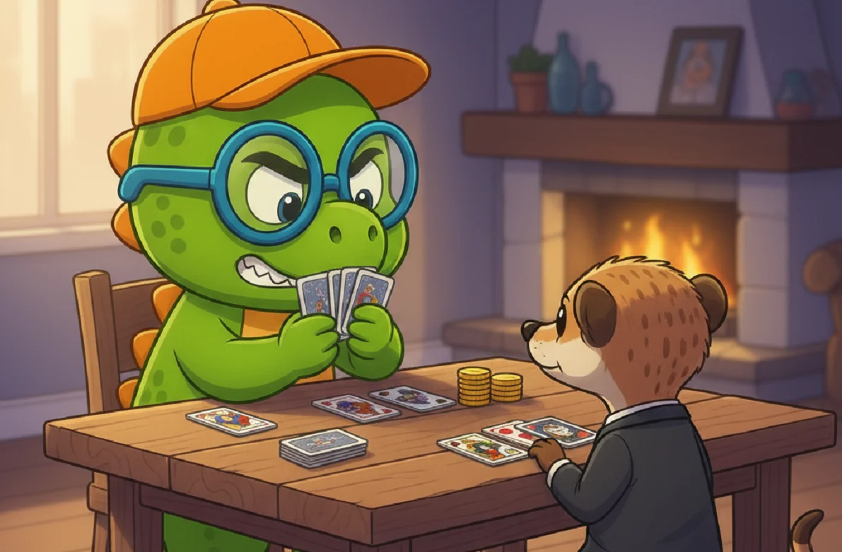
<ImageOnClick imageUrl="/img/friends.webp" altText="Dinosaur" buttonName="Click me" />
Emoji Button
<ImageOnClick imageUrl="/img/friends.webp" altText="Dinosaur" buttonName="🔎" />
Using markdown emoji: 🔎
This article is part of the Design your site series:
Like, share or comment on BlueSky
Loading comments…
Related posts

Component LogoIcon
September 15, 2025
Component Card
September 7, 2025