
Component Skill Bars & Circles
· 14 min read ·

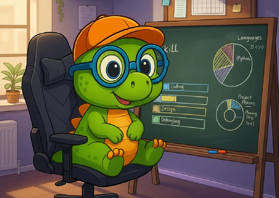
I created the Skill component to display skills as progress bars or animated circles with scroll animations and complete customization.
I've added JSDoc comments in the code to explain each prop and its function. I've never done this before but I think I'll keep this habit.
85%
95%
90%
Component Code
Files structure
📁src
📁components
📁Skill
index.js
styles.module.css
📁theme
MDXComponents.js
Code
// ===============================================
// SKILL COMPONENT - Progress Bars and Circles by DocuxLab
// ===============================================
// This component allows displaying skills as:
// - Progress bars (type="bar")
// - Progress circles (type="circle")
// With scroll animations and complete customization

import React, { useEffect, useRef, useState } from 'react';
import PropTypes from 'prop-types';
import styles from './styles.module.css';

/**
 * Skill Component - Display skills with bars or circles
 *
 * @param {React.ReactNode} name - Nom ou contenu JSX (texte, icône, fragment)
 * @param {number} value - Mastery percentage (0-100)
 * @param {string} type - Display type: 'bar' or 'circle'
 * @param {string} color - Custom color (optional)
 * @param {object} gradient - Gradient object {from: "color1", to: "color2"}
 * @param {boolean} rounded - Rounded borders (true/false)
 * @param {string} valuePosition - Text position: 'top', 'center', 'around'
 * @param {boolean} showPercentage - Show percentage
 * @param {number} size - Circle size in pixels
 * @param {number} height - Bar height in pixels
 * @param {number} thickness - Circle thickness in pixels
 * @param {number} animationDuration - Animation duration in seconds
 * @param {boolean} animateOnScroll - Trigger animation on scroll
 * @param {string} className - Additional CSS classes
 */
export default function Skill({
  name,
  value = 0,
  type = 'bar',
  color,
  gradient,
  rounded = true,
  valuePosition = 'top',
  showPercentage = true,
  size = 120,
  height = 20,
  thickness = 8,
  animationDuration = 1.5,
  animateOnScroll = true,
  className = '' // Nouvelle prop className
}) {
  // ===============================================
  // SCROLL ANIMATION MANAGEMENT
  // ===============================================

  // DOM reference to observe the element
  const containerRef = useRef(null);

  // State to know if the element is visible (triggers animation)
  const [isVisible, setIsVisible] = useState(!animateOnScroll);

  // Effect hook to configure the Intersection Observer
  useEffect(() => {
    // If scroll animation is disabled, exit
    if (!animateOnScroll) return;

    // Intersection observer configuration
    const observer = new IntersectionObserver(
      ([entry]) => {
        // When the element becomes visible
        if (entry.isIntersecting) {
          setIsVisible(true);
          // Stop observing after the first appearance
          observer.unobserve(entry.target);
        }
      },
      {
        // Element must be 30% visible to trigger animation
        threshold: 0.3,
        // Triggers slightly before element is completely visible
        rootMargin: '0px 0px -50px 0px'
      }
    );

    // Start observing if element exists
    if (containerRef.current) {
      observer.observe(containerRef.current);
    }

    // Cleanup on component destruction
    return () => observer.disconnect();
  }, [animateOnScroll]);

  // ===============================================
  // COLOR UTILITY FUNCTIONS
  // ===============================================

  /**
   * Generates automatic color based on percentage
   * Color system by tiers:
   * - 80%+ : Green (very good)
   * - 60-79% : Yellow (good)
   * - 40-59% : Orange (average)
   * - 20-39% : Red (weak)
   * - <20% : Dark red (very weak)
   */
  const getAutoColor = (value) => {
    if (value >= 80) return '#4CAF50'; // Green - Expert
    if (value >= 60) return '#e5ff00ff'; // Yellow - Advanced
    if (value >= 40) return '#FF9800'; // Orange - Intermediate
    if (value >= 20) return '#ff4107ff'; // Red - Beginner
    return '#f44336'; // Dark red - Default
  };

  // Final color: custom color or automatic color
  const finalColor = color || getAutoColor(value);

  /**
   * Gets background color according to current theme (light/dark)
   * Necessary for conic gradients in circles
   */
  const getBackgroundColor = () => {
    if (typeof window !== 'undefined') {
      // Check if dark theme is active
      const isDark = document.documentElement.getAttribute('data-theme') === 'dark';
      return isDark ? '#444' : '#e0e0e0';
    }
    return '#e0e0e0'; // Default color
  };

  /**
   * Generates CSS style for gradients
   * - For bars: linear gradient from left to right
   * - For circles: conic gradient with empty area in background color
   */
  const getGradientStyle = () => {
    if (gradient) {
      return type === 'circle'
        ? `conic-gradient(${gradient.from} 0deg, ${gradient.to} ${(value * 3.6)}deg, ${getBackgroundColor()} ${(value * 3.6)}deg)`
        : `linear-gradient(to right, ${gradient.from}, ${gradient.to})`;
    }
    return finalColor;
  };

  // ===============================================
  // CIRCLE COMPONENT RENDERING
  // ===============================================
  if (type === 'circle') {
    // Mathematical calculations for SVG circle thanks IA :D
    const radius = (size / 2) - (thickness / 2) - 5; // Radius minus margin
    const circumference = 2 * Math.PI * radius; // Total circumference
    const strokeDasharray = circumference; // Dash size

    // Animation: visible part of circle according to percentage
    const strokeDashoffset = isVisible ? circumference - (value / 100) * circumference : circumference;

    // Generate unique ID for gradient
    const gradientId = `gradient-${Math.random().toString(36).substr(2, 9)}`;

    return (
      <div
        ref={containerRef}
        className={`${styles.skillCircleContainer} ${className}`}
        style={{ width: size, height: size }}
      >
        {/* Name displayed above the circle */}
        {valuePosition === 'top' && (
          <div className={styles.skillNameCircle}>{name}</div>
        )}

        <div className={styles.skillCircleWrapper}>
          {/* SVG containing both circles */}
          <svg width={size} height={size} className={styles.skillCircleSvg}>

            {/* SVG gradient definition (must be before circles) */}
            {gradient && (
              <defs>
                <linearGradient id={gradientId} x1="0%" y1="0%" x2="100%" y2="100%">
                  <stop offset="0%" stopColor={gradient.from} />
                  <stop offset="100%" stopColor={gradient.to} />
                </linearGradient>
              </defs>
            )}

            {/* Background circle (gray, static) */}
            <circle
              cx={size/2}
              cy={size/2}
              r={radius}
              fill="none"
              stroke="var(--skill-circle-background)" // Adaptive CSS variable
              strokeWidth={thickness}
            />

            {/* Progress circle (colored, animated) */}
            <circle
              cx={size/2}
              cy={size/2}
              r={radius}
              fill="none"
              stroke={gradient ? `url(#${gradientId})` : finalColor}
              strokeWidth={thickness}
              strokeLinecap={rounded ? "round" : "butt"} // Rounded or sharp borders
              strokeDasharray={strokeDasharray} // Defines total circumference
              strokeDashoffset={strokeDashoffset} // Hidden part (animation)
              className={styles.skillCircleProgress}
              style={{
                animationDuration: `${animationDuration}s`,
                '--circle-circumference': circumference // CSS variable for animation
              }}
            />
          </svg>

          {/* Text positioned in the center of the circle */}
          {valuePosition === 'center' && (
            <div className={styles.skillCircleText}>
              <div
                className={styles.skillCircleName}
                style={{ fontSize: `${Math.max(size * 0.08, 10)}px` }} // Adaptive size
              >
                {name}
              </div>
              {showPercentage && (
                <div
                  className={styles.skillCircleValue}
                  style={{ fontSize: `${Math.max(size * 0.12, 14)}px` }} // Adaptive size
                >
                  {value}%
                </div>
              )}
            </div>
          )}
        </div>

        {/* Text positioned around the circle */}
        {valuePosition === 'around' && (
          <div className={styles.skillCircleAround}>
            <div className={styles.skillNameAround}>{name}</div>
            {showPercentage && (
              <div className={styles.skillValueAround}>{value}%</div>
            )}
          </div>
        )}
      </div>
    );
  }

  // ===============================================
  // BAR COMPONENT RENDERING
  // ===============================================

  return (
    <div ref={containerRef} className={styles.skillBarContainer}>

      {/* Header with name and percentage */}
      {valuePosition === 'top' && (
        <div className={styles.skillBarHeader}>
          <span className={styles.skillBarName}>{name}</span>
          {showPercentage && (
            <span className={styles.skillBarValue}>{value}%</span>
          )}
        </div>
      )}

      {/* Bar container (gray background) */}
      <div
        className={`${styles.skillBarTrack} ${rounded ? styles.rounded : ''}`}
        style={{ height: `${height}px` }}
      >
        {/* Progress bar (colored, animated) */}
        <div
          className={`${styles.skillBarFill} ${rounded ? styles.rounded : ''} ${isVisible ? styles.animate : ''}`}
          style={{
            width: isVisible ? `${value}%` : '0%', // Animation: 0% → target value
            background: getGradientStyle(), // Color or gradient
            animationDuration: `${animationDuration}s`
          }}
        />

        {/* Centered text on the bar */}
        {valuePosition === 'center' && (
          <div className={styles.skillBarCenterContainer}>
            <div className={styles.skillBarCenterName}>{name}</div>
            {showPercentage && (
              <div className={styles.skillBarCenterText}>{value}%</div>
            )}
          </div>
        )}
      </div>
    </div>
  );
}

Skill.propTypes = {
  name: PropTypes.node.isRequired,
  value: PropTypes.number,
  type: PropTypes.oneOf(['bar', 'circle']),
  color: PropTypes.string,
  gradient: PropTypes.shape({
    from: PropTypes.string.isRequired,
    to: PropTypes.string.isRequired
  }),
  rounded: PropTypes.bool,
  valuePosition: PropTypes.oneOf(['top', 'center', 'around']),
  showPercentage: PropTypes.bool,
  size: PropTypes.number,
  height: PropTypes.number,
  thickness: PropTypes.number,
  animationDuration: PropTypes.number,
  animateOnScroll: PropTypes.bool,
  className: PropTypes.string
};
/*
   SKILL COMPONENT - CSS STYLES

   This file contains all styles for skill bars
   and circles with animations and themes
 */

/* === CSS VARIABLES FOR THEMES === */
:root {
  /* Light mode (default) */
  --skill-track-background: #e0e0e0;    /* Bar backgrounds */
  --skill-circle-background: #e0e0e0;   /* Circle backgrounds */
}

[data-theme='dark'] {
  /* Dark mode */
  --skill-track-background: #333;       /* Darker bar backgrounds */
  --skill-circle-background: #444;      /* Darker circle backgrounds */
}


/* Main bar container */
.skillBarContainer {
  margin: 1rem 0;
  opacity: 0;                          /* Invisible by default */
  transform: translateY(20px);         /* Offset downward */
  animation: fadeInUp 0.6s ease forwards; /* Appearance animation */
}

/* Header with name and percentage */
.skillBarHeader {
  display: flex;
  justify-content: space-between;      /* Name left, % right */
  align-items: center;
  margin-bottom: 0.5rem;
}

/* Skill name */
.skillBarName {
  font-weight: 600;
  color: var(--ifm-color-content);     /* Theme adaptive color */
}

/* Percentage value */
.skillBarValue {
  font-weight: 500;
  color: var(--ifm-color-primary);     /* Theme primary color */
}

/* Bar track (gray background) */
.skillBarTrack {
  background-color: var(--skill-track-background); /* Adaptive CSS variable */
  position: relative;
  overflow: hidden;                    /* Hide overflows */
}

/* Rounded borders for track */
.skillBarTrack.rounded {
  border-radius: 10px;
}

/* Colored bar fill */
.skillBarFill {
  height: 100%;
  background-color: #4CAF50;           /* Default color */
  transition: width 0.8s cubic-bezier(0.4, 0, 0.2, 1); /* Smooth animation */
}

/* Additional animation for bars */
.skillBarFill.animate {
  animation: fillAnimation forwards;
}

/* Rounded borders for fill */
.skillBarFill.rounded {
  border-radius: 10px;
}

/* Container for centered text on bar */
.skillBarCenterContainer {
  position: absolute;
  top: 50%;
  left: 50%;
  transform: translate(-50%, -50%);
  display: flex;
  align-items: center;
  gap: 0.5rem;
  white-space: nowrap;                 /* Empêche le retour à la ligne */
}

/* Centered skill name on bar */
.skillBarCenterName {
  color: white;                        /* Contrast on colored background */
  font-weight: 600;
  font-size: 0.875rem;
  text-shadow: 1px 1px 2px rgba(0,0,0,0.5); /* Shadow for readability */
}

/* Centered percentage text on bar (updated) */
.skillBarCenterText {
  color: white;                        /* Contrast on colored background */
  font-weight: bold;
  font-size: 0.875rem;
  text-shadow: 1px 1px 2px rgba(0,0,0,0.5); /* Shadow for readability */
}


/* Main circle container */
.skillCircleContainer {
  position: relative;
  display: inline-block;
  margin: 1rem;
  opacity: 0;                          /* Invisible by default */
  transform: translateY(20px);         /* Offset downward */
  animation: fadeInUp 0.6s ease forwards; /* Appearance animation */
}

/* Name displayed above circle */
.skillNameCircle {
  text-align: center;
  font-weight: 600;
  margin-bottom: 0.5rem;
  color: var(--ifm-color-content);     /* Theme adaptive color */
}

/* Wrapper to position SVG */
.skillCircleWrapper {
  position: relative;
}

/* Circle SVG (rotated -90° to start at top) */
.skillCircleSvg {
  transform: rotate(-90deg);
}

/* Progress circle animation */
.skillCircleProgress {
  transition: stroke-dashoffset 0.8s cubic-bezier(0.4, 0, 0.2, 1); /* Smooth animation */
}

/* Text positioned in center of circle */
.skillCircleText {
  position: absolute;
  top: 50%;
  left: 50%;
  transform: translate(-50%, -50%);
  text-align: center;
}

/* Skill name inside circle */
.skillCircleName {
  font-weight: 600;
  font-size: 0.875rem;                /* Default size (adjusted by JS) */
  color: var(--ifm-color-content);
  margin-bottom: 0.25rem;
}

/* Percentage value inside circle */
.skillCircleValue {
  font-weight: bold;
  font-size: 1.25rem;                 /* Default size (adjusted by JS) */
  color: var(--ifm-color-primary);
}

/* Container for text around circle */
.skillCircleAround {
  position: absolute;
  top: 100%;                          /* Below the circle */
  left: 50%;
  transform: translateX(-50%);        /* Horizontally centered */
  text-align: center;
  margin-top: 0.5rem;
}

/* Skill name around circle */
.skillNameAround {
  font-weight: 600;
  color: var(--ifm-color-content);
}

/* Value around circle */
.skillValueAround {
  font-weight: bold;
  color: var(--ifm-color-primary);
}


/* Bar fill animation (0% → value) */
@keyframes fillAnimation {
  from {
    width: 0%;                         /* Starts empty */
  }
  /* to: width inherited from inline style */
}

/* Circle animation (full circumference → value) */
@keyframes circleAnimation {
  from {
    stroke-dashoffset: var(--circle-circumference, 283); /* Starts hidden */
  }
  /* to: stroke-dashoffset inherited from inline style */
}

/* Scroll appearance animation */
@keyframes fadeInUp {
  from {
    opacity: 0;                        /* Invisible */
    transform: translateY(20px);       /* Offset downward */
  }
  to {
    opacity: 1;                        /* Visible */
    transform: translateY(0);          /* Normal position */
  }
}

/* ================================================
   RESPONSIVE DESIGN
   ================================================ */

/* Mobile adaptation */
@media (max-width: 768px) {
  .skillCircleContainer {
    margin: 0.5rem;                    /* Reduced margins on mobile */
  }

  .skillBarContainer {
    margin: 0.75rem 0;                 /* Reduced margins on mobile */
  }
}
When to Use the Skill Component
Display Types
- Horizontal bars (
type="bar") - Progress circles (
type="circle")
Customization
- Automatic colors based on percentage (green→yellow→orange→red)
- Custom colors with hex, RGB, or named colors
- Gradients (linear for bars, conic for circles)
- Text positioning (top, center, or around for circles)
- Size control (configurable width/height for bars, diameter for circles)
- Thickness control (stroke width for circles, height for bars)
- Border styles (rounded or sharp corners)
- Animation control (scroll-triggered or immediate, custom duration)
- Percentage display (show/hide percentage values)
- Theme adaptation (automatic light/dark mode support)
Animations
- Scroll animation with Intersection Observer
- Smooth transitions with cubic-bezier
- Fade-in appearance with vertical translation
Automatic Color System
The component automatically generates colors based on percentage:
- 80%+ : 🟢 Green (#4CAF50) - Expert
- 60-79% : 🟡 Bright Yellow (#e5ff00ff) - Advanced
- 40-59% : 🟠 Orange (#FF9800) - Intermediate
- 20-39% : 🔴 Bright Red (#ff4107ff) - Beginner
<20%: 🔴 Dark Red (#f44336) - Very weak
Themes
- Light/dark mode automatic
- Adaptive CSS variables
Available Props
| Prop | Type | Default | Description |
|---|---|---|---|
name | string | - | Skill name |
value | number | 0 | Percentage (0-100) |
type | string | "bar" | "bar" or "circle" |
color | string | auto | Custom color |
gradient | object | - | {from: "color1", to: "color2"} |
rounded | boolean | true | Rounded borders |
valuePosition | string | "top" | "top", "center", "around" |
showPercentage | boolean | true | Show % |
size | number | 120 | Circle size (px) |
height | number | 20 | Bar height (px) |
thickness | number | 8 | Circle thickness (px) |
animationDuration | number | 1.5 | Animation duration (s) |
animateOnScroll | boolean | true | Scroll animation |
Bars
Bars with automatic colours (based on percentage)
<Skill name="Expert" value={95} type="bar" />
<Skill name="Advanced" value={75} type="bar" />
<Skill name="Intermediate" value={50} type="bar" />
<Skill name="Beginner" value={25} type="bar" />
<Skill name="Very weak" value={10} type="bar" />
Expert95%
Advanced75%
Intermediate50%
Beginner25%
Very weak10%
Bars with custom colors
<Skill name="JavaScript" value={85} type="bar" color="#F7DF1E" />
<Skill name="React" value={75} type="bar" color="#61DAFB" />
<Skill name="Vue.js" value={60} type="bar" color="#4FC08D" />
<Skill name="Angular" value={45} type="bar" color="#DD0031" />
<Skill name="Svelte" value={30} type="bar" color="#FF3E00" />
JavaScript85%
React75%
Vue.js60%
Angular45%
Svelte30%
Bars with gradients
<Skill name="CSS3" value={90} type="bar" gradient={{ from: '#1572B6', to: '#33A9DC' }} />
<Skill name="HTML5" value={95} type="bar" gradient={{ from: '#e3d626ff', to: '#1ad843ff' }} />
<Skill name="Sass" value={80} type="bar" gradient={{ from: '#CC6699', to: '#910b52ff' }} />
<Skill name="Tailwind" value={70} type="bar" gradient={{ from: '#065fd4ff', to: '#0891B2' }} />
CSS390%
HTML595%
Sass80%
Tailwind70%
Bars with different heights
<Skill name="Thin" value={60} type="bar" height={10} color="#FF6B6B" />
<Skill name="Normal" value={70} type="bar" height={20} color="#4ECDC4" />
<Skill name="Thick" value={80} type="bar" height={30} color="#45B7D1" />
<Skill name="Very thick" value={90} type="bar" height={40} color="#F9CA24" />
Thin60%
Normal70%
Thick80%
Very thick90%
Bars with and without rounded borders
<Skill name="Rounded" value={75} type="bar" rounded={true} color="#6C5CE7" />
<Skill name="Square" value={75} type="bar" rounded={false} color="#A29BFE" />
Rounded75%
Square75%
Bars with different text positions
<Skill name="Text at top" value={65} type="bar" valuePosition="top" color="#00B894" />
<Skill name="Centered text" value={75} type="bar" valuePosition="center" color="#00CEC9" />
Text at top65%
Centered text
75%
Bars with animation speeds
<Skill name="Fast animation" value={60} type="bar" animationDuration={0.5} color="#E17055" />
<Skill name="Normal animation" value={70} type="bar" animationDuration={1.5} color="#FDCB6E" />
<Skill name="Slow animation" value={80} type="bar" animationDuration={3.0} color="#6C5CE7" />
Fast animation60%
Normal animation70%
Slow animation80%
Complete technology palette in bars
<div style={{display: 'grid', gridTemplateColumns: '1fr', gap: '10px', marginTop: '20px'}}>
  <Skill name={<><LogoIcon name="html-5" size='24' /> HTML5</>} value={95} type="bar" color="#E34F26" height={25} />
  <Skill name={<><LogoIcon name="css-3" size='24' /> CSS3</>} value={90} type="bar" color="#1572B6" height={25} />
  <Skill name={<><LogoIcon name="javascript" size='24' /> JavaScript</>} value={85} type="bar" color="#F7DF1E" height={25} />
  <Skill name={<><LogoIcon name="typescript-icon-round" size='24' /> TypeScript</>} value={80} type="bar" color="#3178C6" height={25} />
  <Skill name={<><LogoIcon name="react" size='24' /> React</>} value={88} type="bar" color="#61DAFB" height={25} />
  <Skill name={<><LogoIcon name="vue" size='24' /> Vue.js</>} value={75} type="bar" color="#4FC08D" height={25} />
  <Skill name={<><LogoIcon name="nodejs" size='24' /> Node.js</>} value={82} type="bar" color="#339933" height={25} />
  <Skill name={<><LogoIcon name="python" size='24' /> Python</>} value={78} type="bar" color="#3776AB" height={25} />
</div>
HTML595%
CSS390%
JavaScript85%
TypeScript80%
React88%
Vue.js75%
Node.js82%
Python78%
Bars at 0
<Skill name="No animation" value={0} type="bar" color="#2D3436" />
No animation0%
Circles
Circles with automatic colors
<Skill name="Expert" value={95} type="circle" valuePosition="center" />
<Skill name="Advanced" value={75} type="circle" valuePosition="center" />
<Skill name="Intermediate" value={50} type="circle" valuePosition="center" />
<Skill name="Beginner" value={25} type="circle" valuePosition="center" />
Expert
95%
Advanced
75%
Intermediate
50%
Beginner
25%
Circles with custom colors
<Skill name="Node.js" value={80} type="circle" valuePosition="center" color="#fffb00ff" />
<Skill name="Python" value={70} type="circle" valuePosition="center" color="#3776AB" />
<Skill name="Java" value={60} type="circle" valuePosition="center" color="#fc0478ff" />
<Skill name="C#" value={50} type="circle" valuePosition="center" color="#d43c3cff" />
Node.js
80%
Python
70%
Java
60%
C#
50%
Circles with gradients
<Skill name="Docker" value={75} type="circle" gradient={{ from: '#0cb628ff', to: '#b7ed24ff' }} valuePosition="center" />
<Skill name="Kubernetes" value={65} type="circle" gradient={{ from: '#1c4cb4ff', to: '#1A73E8' }} valuePosition="center" />
<Skill name="AWS" value={70} type="circle" gradient={{ from: '#FF9900', to: '#f80929ff' }} valuePosition="center" />
Docker
75%
Kubernetes
65%
AWS
70%
Circles with different sizes
<Skill name="Small" value={60} type="circle" size={80} valuePosition="center" color="#FF6B6B" />
<Skill name="Medium" value={70} type="circle" size={120} valuePosition="center" color="#4ECDC4" />
<Skill name="Large" value={80} type="circle" size={160} valuePosition="center" color="#45B7D1" />
Small
60%
Medium
70%
Large
80%
Circles with different thicknesses
<Skill name="Thin" value={65} type="circle" thickness={4} valuePosition="center" color="#A29BFE" />
<Skill name="Normal" value={75} type="circle" thickness={8} valuePosition="center" color="#6C5CE7" />
<Skill name="Thick" value={85} type="circle" thickness={16} valuePosition="center" color="#5F3DC4" />
Thin
65%
Normal
75%
Thick
85%
Circles with text positions
<Skill name="Text at top" value={70} type="circle" valuePosition="top" color="#00B894" />
<Skill name="Centered text" value={80} type="circle" valuePosition="center" color="#00CEC9" />
<Skill name="Text around" value={90} type="circle" valuePosition="around" color="#55A3FF" className="margin-bottom--xl" />
Text at top
Centered text
80%
Text around
90%
Circles with and without rounded borders
<Skill name="Rounded" value={75} type="circle" rounded={true} valuePosition="center" color="#E17055" />
<Skill name="Square" value={75} type="circle" rounded={false} valuePosition="center" color="#FDCB6E" />
Rounded
75%
Square
75%
Circles with and without percentage
<Skill name="With %" value={80} type="circle" showPercentage={true} valuePosition="center" color="#00B894" />
<Skill name="Without %" value={80} type="circle" showPercentage={false} valuePosition="center" color="#E17055" />
With %
80%
Without %
Circles with animation speeds
<Skill name="Fast" value={60} type="circle" animationDuration={0.8} valuePosition="center" color="#FF6B6B" />
<Skill name="Normal" value={70} type="circle" animationDuration={1.5} valuePosition="center" color="#4ECDC4" />
<Skill name="Slow" value={80} type="circle" animationDuration={2.5} valuePosition="center" color="#45B7D1" />
Fast
60%
Normal
70%
Slow
80%
Circles without animation at zero
<Skill name="Static" value={0} type="circle" animateOnScroll={false} valuePosition="center" color="#2D3436" />
Static
0%
Advanced combined examples
<Skill
  name="Full Stack Developer"
  value={88}
  type="circle"
  size={180}
  thickness={15}
  gradient={{ from: '#667eea', to: '#764ba2' }}
  valuePosition="center"
  animationDuration={2.5}
  rounded={true}
/>

<Skill
  name="DevOps Master"
  value={92}
  type="bar"
  height={35}
  gradient={{ from: '#f093fb', to: '#f5576c' }}
  valuePosition="center"
  animationDuration={2.0}
  rounded={true}
/>
Full Stack Developer
88%
DevOps Master
92%
Complete technology palette
<div style={{display: 'grid', gridTemplateColumns: 'repeat(auto-fit, minmax(150px, 1fr))', gap: '20px', marginTop: '20px'}}>
  <Skill name={<><LogoIcon name="html-5" size='24' /> </>} value={95} type="circle" color="#E34F26" valuePosition="center" size={100} />
  <Skill name={<><LogoIcon name="css-3" size='24' /> </>} value={90} type="circle" color="#1572B6" valuePosition="center" size={100} />
  <Skill name={<><LogoIcon name="javascript" size='24' /> </>} value={85} type="circle" color="#F7DF1E" valuePosition="center" size={100} />
  <Skill name={<><LogoIcon name="typescript-icon-round" size='24' /> </>} value={80} type="circle" color="#3178C6" valuePosition="center" size={100} />
  <Skill name={<><LogoIcon name="react" size='24' /> </>} value={88} type="circle" color="#61DAFB" valuePosition="center" size={100} />
  <Skill name={<><LogoIcon name="vue" size='24' /> </>} value={75} type="circle" color="#4FC08D" valuePosition="center" size={100} />
  <Skill name={<><LogoIcon name="nodejs" size='24' /> </>} value={82} type="circle" color="#339933" valuePosition="center" size={100} />
  <Skill name={<><LogoIcon name="python" size='24' /> </>} value={78} type="circle" color="#3776AB" valuePosition="center" size={100} />
</div>
95%
90%
85%
80%
88%
75%
82%
78%
Comparison bars vs circles
Same skill, two representations, make your choice
Database Design75%
Database Design
75%
Use with cards component
<Columns>
    <Column>
        <Card>
            <CardBody>
                <center>
                    <Skill
                        name={<><LogoIcon name="javascript" size='64' /> </>}
                        value={85}
                        type="circle"
                        color="#F7DF1E"
                        valuePosition="center"
                        size={200}/>
                </center>
            </CardBody>
        </Card>
    </Column>
    <Column>
        <Card>
            <CardBody>
                <Skill
                    name={<><LogoIcon name="html-5" size='24' /> HTML5</>}
                    value={95}
                    type="bar"
                    color="#E34F26"
                    height={25}/>
                <Skill
                    name={<><LogoIcon name="css-3" size='24' /> CSS3</>}
                    value={90}
                    type="bar"
                    color="#1572B6"
                    height={25}/>

            </CardBody>
        </Card>
    </Column>
</Columns>
85%
HTML595%
CSS390%
This article is part of the Design your site series:
Like, share or comment on BlueSky
Loading comments…
Related posts
Component Tooltip
September 21, 2025

Creating Custom 404 Page
October 29, 2025
ScrollToTopButton Component
October 6, 2025
Component ImageOnClick
September 5, 2025
Component Card
September 7, 2025
Tutorial Docusaurus React Live
October 1, 2025